The winners of this year’s Retail Week Interiors Awards really do represent the pick of what’s out there. John Ryan reports.
The Retail Week Interiors Awards are close to a decade and a half old now and at the beginning of each year it’s tempting to yield to an old hand-style cynicism that says there’s little that will be new. And yet the surprising fact is that there has yet to be a year when there aren’t a crop of interesting and fresh formats, redesigned stores and visual merchandising - all worthy of being recognised.
The thing about retail is that nothing can ever really stay the same for long: shoppers just won’t put up with it. For which reason, any of the retailers that have carried off gongs over the next few pages are deserving winners.
So this is about as good as it gets in the UK, and elsewhere, and as inspiration knows few boundaries, it’s worth having a look at to see how things really can be done differently.
The Birley food and supermarket design of the year
Ruci & Idoni, Hyderabad, India
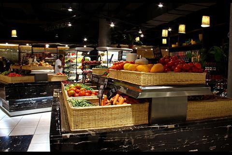
Less of a supermarket and rather more of a farmers’ market-cum-foodie event, the Ruci & Idoni store, created by CADA Design, makes you want to buy almost everything in sight. With distinctly un-supermarket-like touches, such as a blacked-out ceiling with spotlights and swirling graphic treatments on the walls that wouldn’t look out of place in a fashion store, this is a food retailer that has stand out.
The use of high-quality dark wood in the ambient goods area and dark leather armchairs in the in-store cafe, make this an experience and promote a sense of quality and excitement, instead of the normal food shopping chore.
The leisure technique Best edge-of-town/out-of-town store
Winner: Dobbies Garden World, Aberdeen
Highly commended: Van Hage, Peterborough Garden Park; Best Buy, Thurrock
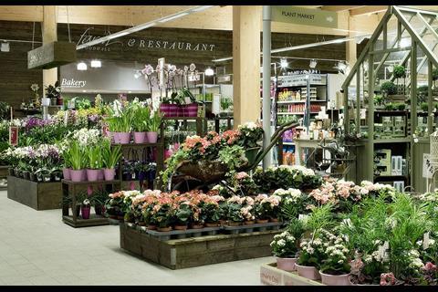
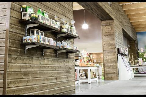
Open for little more than six months, Tesco-owned Dobbies has opened this behemoth on the outskirts of Aberdeen with a flourish. Designed by Edge Architecture + Design, in spite of its being a garden centre, visitors will probably find as much to entertain and divert indoors as outside. The carefully zoned interior includes everything from fish and reptiles to delicatessen food sourced locally and displayed in surroundings that would put the great majority of shoppers to shame.
The Patton Fit-out department store interior of the year
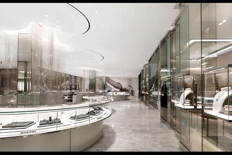
Winner: Brown Thomas luxury hall, Dublin
Highly commended: John Lewis, Cardiff
This is a straightforward, but beautiful, answer to the challenge of creating a luxury environment that will be both easy to understand and shop in, as well as easy on the eye. Designers Burdifilek have come up with an interior that manages to hold its head up against the considerable internal competition of some of the refurbished rooms in Dublin’s premier department store. There is a real sense of luxury about the palette of materials that have been used and the manner in which they have been deployed. This is also an environment capable of making visitors feel special.
The Premier Interior Systems best small shop interior
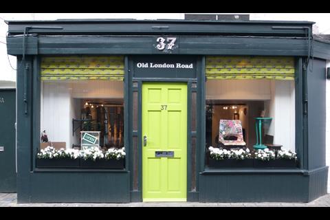
Winner: 37 Old London Road, Kingston, Surrey - Small Back Room
A sense of the domestic pervades every aspect of this small, but beatifully executed piece of store design. 37 Old London Road makes you feel as if you’ve wandered into someone’s front room; curiously it was designed by Small Back Room, using visual tropes such as cupboards, or at least the drawers from them, attached to the wall and painted in a contrast colour. If you wanted to know how to do something inexpensively but effectively, this is an object lesson.
Point-of-purchase campaign of the year
Winner: Sony New Store, Europe
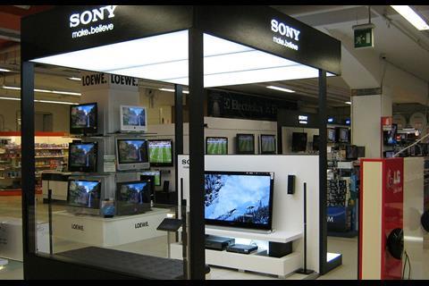
The best point-of-purchase is about a good deal more than attracting intention, although clearly this is part of what it should do. Moving beyond this, point of purchase should entice the shopper into parting with cash and Sony’s campaign - taken to stores across Europe - does exactly this. This is particularly impressive when the sheer volume of point-of-purchase material used in the electricals sector is taken into consideration. It is also worth noting the way in which this point of purchase uses the product to achieve real stand-out and prominence in what can be a somewhat bland area of the market.
A strong and well-put together creative execution.
The Birley manufacturing Best in-store restaurant of the year
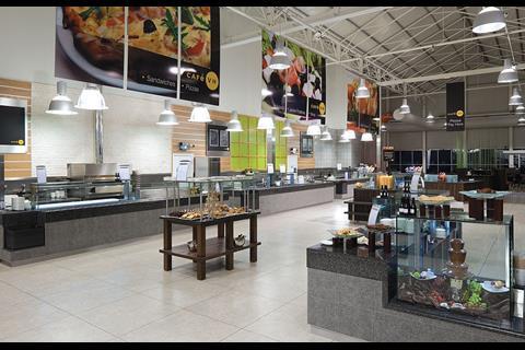
Winner: Van Hage Peterborough Garden Park
You probably wouldn’t expect the winner of this category to be found in what is, in effect, an edge-of-town shed. Yet such was the quality and attention to detail of the catering environment created by the HPW Partnership, that this one found its way to the top of the pile. In the normal run of things you’d feel OK if you managed to get a cup of tea and a bun in a store of this kind, but this interior confounds all such expectations. With a high ceiling that is managed through the use of large-format graphics, pendant lights help to keep the eye down at table level and create and uncluttered feel. There is also a distinctly contemporary palette of materials.
The Rare Basics VM Solution of the year
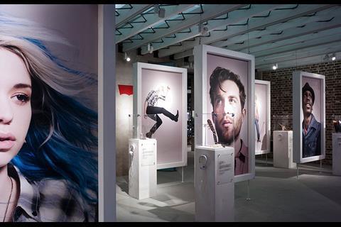
Winner: Levi’s flagship, Regent Street, London
Highly commended: Habitat, Westfield, London; Timberland Boot Company, Spitalfields, London
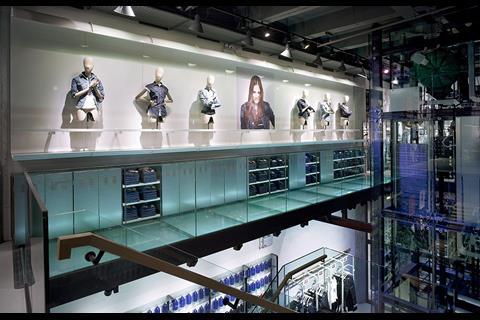
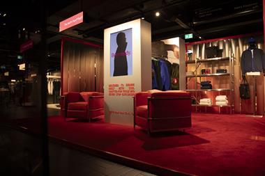
Whether it’s the lower body mannequins, displaying the many pairs of jeans that are on offer, or the way in which shoppers can look at a fit and then locate it with ease among a sea of other blue and black denim, this store is a masterclass in taking a single, largely undifferentiated commodity, and helping shoppers to understand how it works. The association of youth, handicraft and the heritage that underpins the Levi’s brand is something that this flagship store’s visual merchandising excels at making easy to understand. Visual merchandising details such as cobbler’s lasts and vintage memorabilia are stunning.
The Portview Fit-out fashion retail interior of the year
Winners: Levi’s flagship, Regent Street London and JD Sports, Cardiff
Highly commended: Topshop, Oxford Circus, London
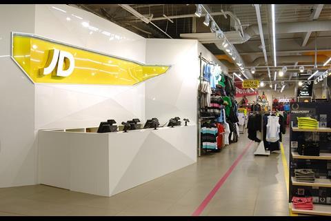
The fact that two such wildly different interiors could share this award is testimony to a very strong field indeed. The Levi’s flagship interior on Regent Street, created by Checkland Kindleysides, was a worthy winner for its ability to present the brand’s heritage in an appealing and relevant manner, while the Briggs Hillier-designed JD Sports flagship in Cardiff shows what can be done to make a cavernous interior interesting. Both stores take the products and the shoppers that are targeted as the starting point for inspired retail spaces.
Pop-up store of the year
Winner: Dr Martens, Spitalfields Market, London
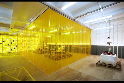
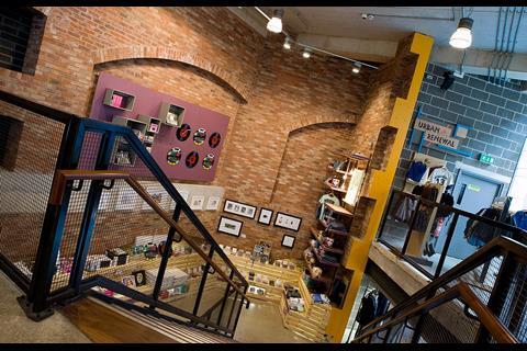
Curiously the Dr Martens store in Spitalfield started life as a highly creative, but ultra low-cost store design intended to trade for no more than three months. Fashioned by design consultancy Campaign, more than nine months after it opened, amid a flurry of press attention, it is still up and running. What it does show is that large quantities of cash are not necessarily a prerequisite to both commercial and aesthetic success. From a design perspective, it is worth noting how this store is a fine example of ‘rough luxe’ - taking an upscale product and situating it as a part of a boho interior to highlight it. It is easy to do, but supremely difficult to do at this level. In terms of in-store features, probably the most outstanding thing is a few simple white fluorescent tubes behind a yellow screen. Cheap, but diverting.
The John Richards shopfitters Best International Retail Interior
Winner: Estella, Cologne, Germany
Highly commended: Monki, Sea of Scallops, Oslo; Limelight Marketplace, New York
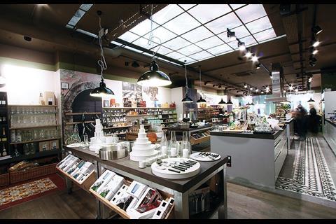
Estella is a store that takes cookware, fine food and shopping and mixes all three to create theatrical retailing and a slick interior of the kind that demands to be visited. Twelve Studio, which worked on the project, has partnered with this new retailer to create a concept capable of loosening foodie purse-strings and conjuring up a vision of how we’d all like our kitchens to look and feel. This is certainly not about value eating, but it is an extension of the ‘fine dining at home’ trend taken back a stage into the kitchen.
The National Association of Shopfitters Shopfitting Excellence award
Winner: Urban Outfitters, Liverpool - shopfitting by McCue Interior Fit-Out Solutions
Highly commended: Ports 1961, Knightsbridge, London - fit-out/project management by Clements Retail
Urban Outfitter’s UK stores boast innovative interiors that look, broadly, as if the store designers have raided the local scrapyard to complete the fit-out. This, of course, is an artful conceit and one that requires exacting skills to pull off. It is to McCue Fit-Out’s credit that the store in Liverpool flatters to deceive with the reach-me-down chic aesthetic feeling as if it is just that - an appearance that is not easily achieved.
Retail destination of the year
Winner: Dobbies Garden World, Aberdeen
Highly commended: New Look, Oxford Street, London
Dobbies scoops the honours for this award for a simple reason - this is a true destination. Shoppers visiting this one won’t have ended up here by accident, it’s very much out on its own in terms of location. A trip to Dobbies in Aberdeen therefore will have been a decision taken in full knowledge of the offer that is to be perused. As such, this store’s ability to attract crowds out from downtown Aberdeen marked it out as an obvious choice for
this category. Naturally, it has the additional merit of avoiding looking like an out-of-town shed and making the visitor feel that the journey has been worthwhile.
The ISG specialist store design of the year award
Winner: Pets at Home, New Malden, Surrey
Highly commended: Moss Bespoke, London; New Look, Oxford Street, London
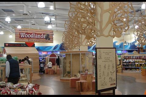
Retail doesn’t come much more niche than a pet store and you might be inclined to think that there really wouldn’t be much point in creating too much of a fuss about the interior of a store of this kind - shoppers will come anyway. This Pets at Home store in New Malden, designed by 20/20, proves that this needn’t be the case, with features ranging from wooden trees to what look like in-store Wendy houses. It’s an interesting mix and one that has found favour with shoppers as well as, presumably, pets.
The Philips Lighting best use of lighting award
Winner: Levi’s flagship store, Regent Street
Light the stock not the store. It’s an easy mantra and one that is frequently repeated these days, as moody lighting has a bit of an in-store moment on the store design front. It is, however, really simple to end up with a store that is in fact nothing more than a dark space with a wealth of shadow and the sense that you can’t really see the offer. The Levi’s flagship on Regent Street wins once more thanks to Erco lighting, which has created a scheme that pinpoints that which needs to be pinpointed while at the same time not leaving the shopper in outer darkness. Dramatic and inspirational.
The Vinci Construction UK Retail Interior of the year
Winner: JD Sports, Cardiff
Whether it’s the giant table-football fixture on the store’s upper level or the elegant light-boxes that are used as running shoe display cases, this is a store that takes a category and makes it worth talking about. It also has that happy ability to take a time-worn form of retailing, the sports store, turn it on its head and come up with something new. This is what good retail design should do and the store design, created by Briggs Hillier, shows what original thought on the part of a design consultancy and a willingness to experiment on the part of a retail client can result in. This is a worthy winner of the top accolade.
The National Association of Shopfitters Store-fit of the year award
Winner: McCue’s Fit-Out.
The judges felt that in terms of both consistency and final product, McuCues proved that it had what was required to scoop this award in 2010. Being a good shopfitter is generally a hard act - you’re unlikely to be noticed or praised, but you will certainly be the centre of attention when things aren’t right. For McCues to take this prize is testimony to a strong performance throughout.













No comments yet